Responsive Design Best Practices for Modern Websites
Mobile-first layouts, fluid typography, container queries, and accessible touch targets — the responsive design playbook for 2026.
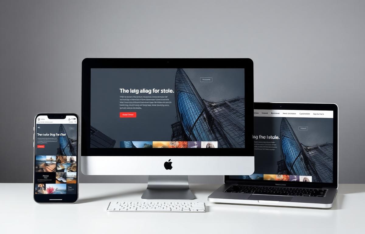
More than 60% of web traffic is mobile. Yet most websites are still designed desktop-first and crammed onto a phone afterwards. Responsive design done right starts on the smallest screen and grows from there.
Mobile First, Always
Design the mobile experience first, then enhance for larger screens. This forces you to prioritize content and removes desktop-only patterns that don't translate.
Fluid Typography With clamp()
Stop writing media queries for font sizes. clamp(1rem, 2vw, 1.25rem) scales smoothly between breakpoints without bumps.
Container Queries Over Media Queries
Style components based on their parent's width, not the viewport. A card knows how to lay itself out whether it's in a sidebar or a full-width grid.
Touch Targets
Minimum 44x44 pixels for any tappable element. Space them apart. Nothing frustrates mobile users more than mis-tapping links.
Test on Real Devices
DevTools simulators lie. Borrow a friend's iPhone, an old Android, and a tablet. The bugs you find will surprise you.